App Redesign
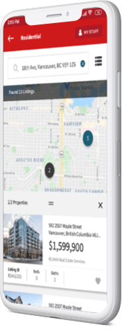
Through a heuristic evaluation and following some strict brand guides I was able to create a seamless real estate search experience.
Overview
The purpose of this app redesign was to improve the usability of the product through a heuristic evaluation
Timeline
2 weeks
Role
Evaluator and UI Designer
Tools
- Figma
- InDesign
- Illustrator
Process
Jakobs Nielsen’s 10 Heuristics
1. Heuristic Evaluation
We first evaluated the app using Jakobs Nielsen’s 10 Heuristics
2. Re-Design
Re-design of each heuristic violation
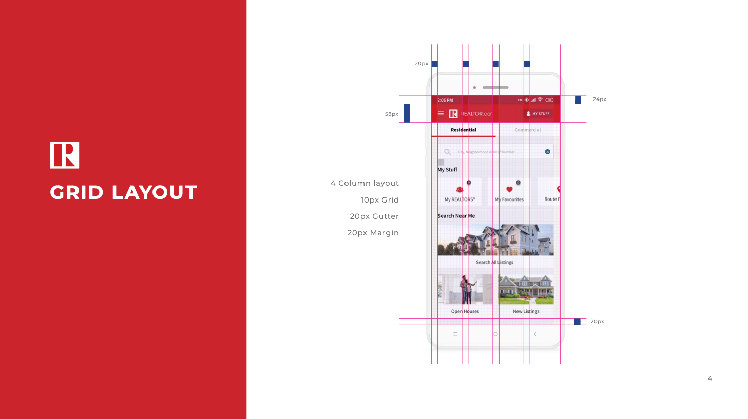
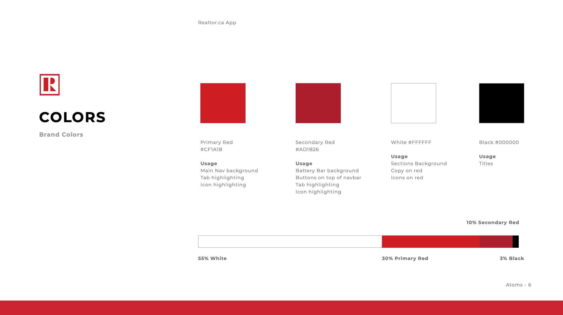
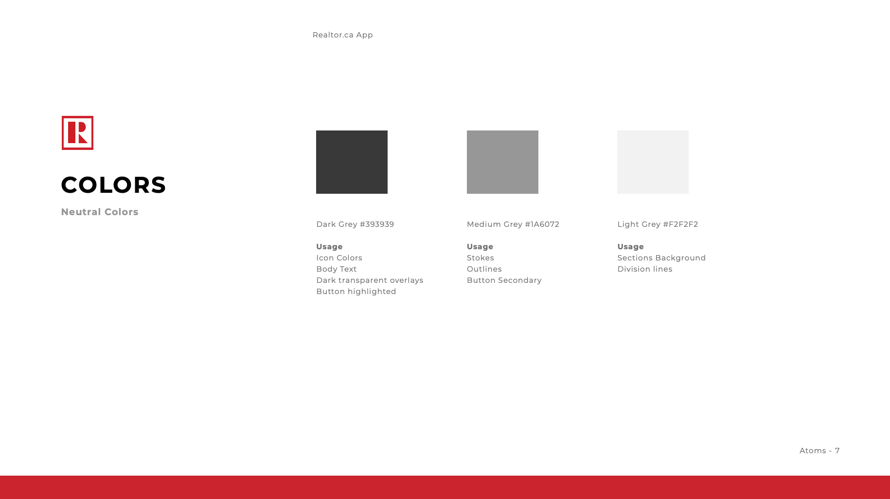
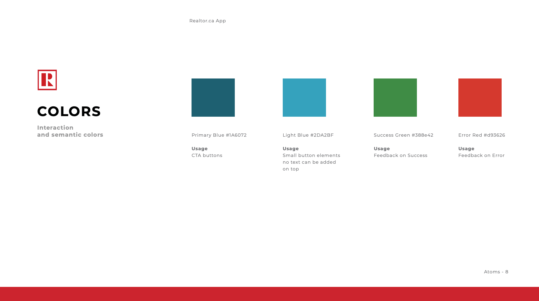
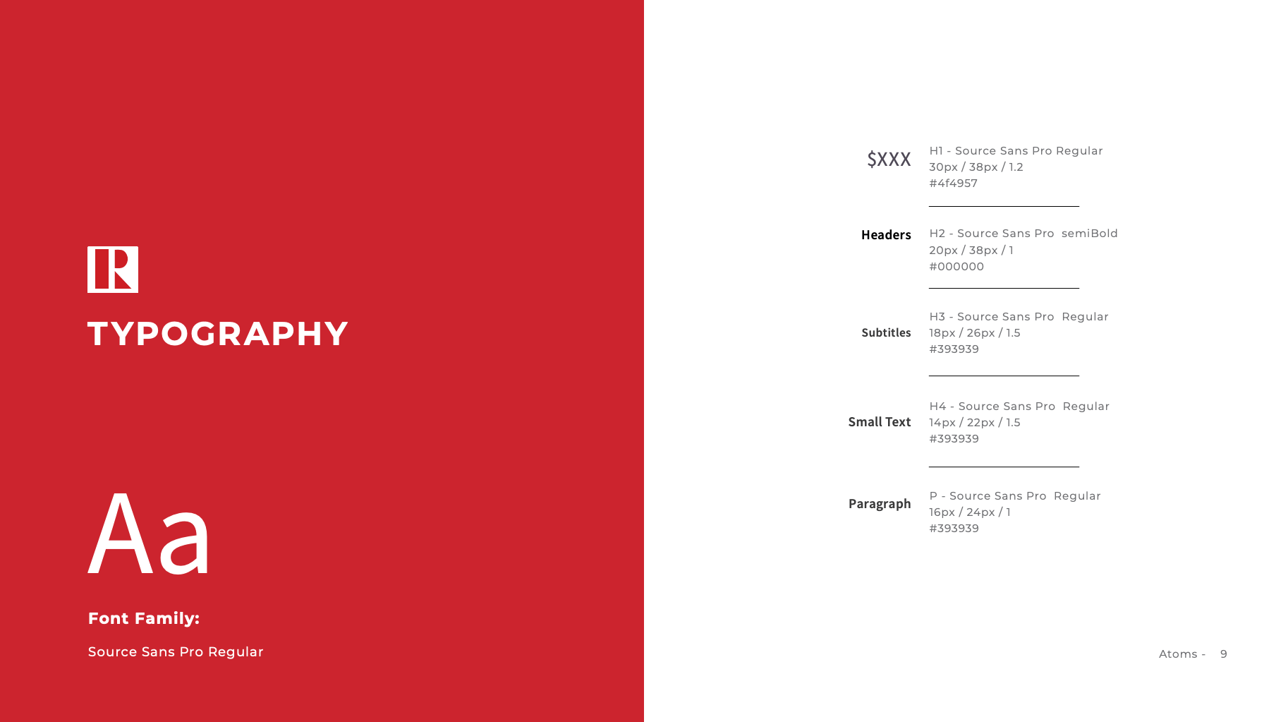
3. UI Library
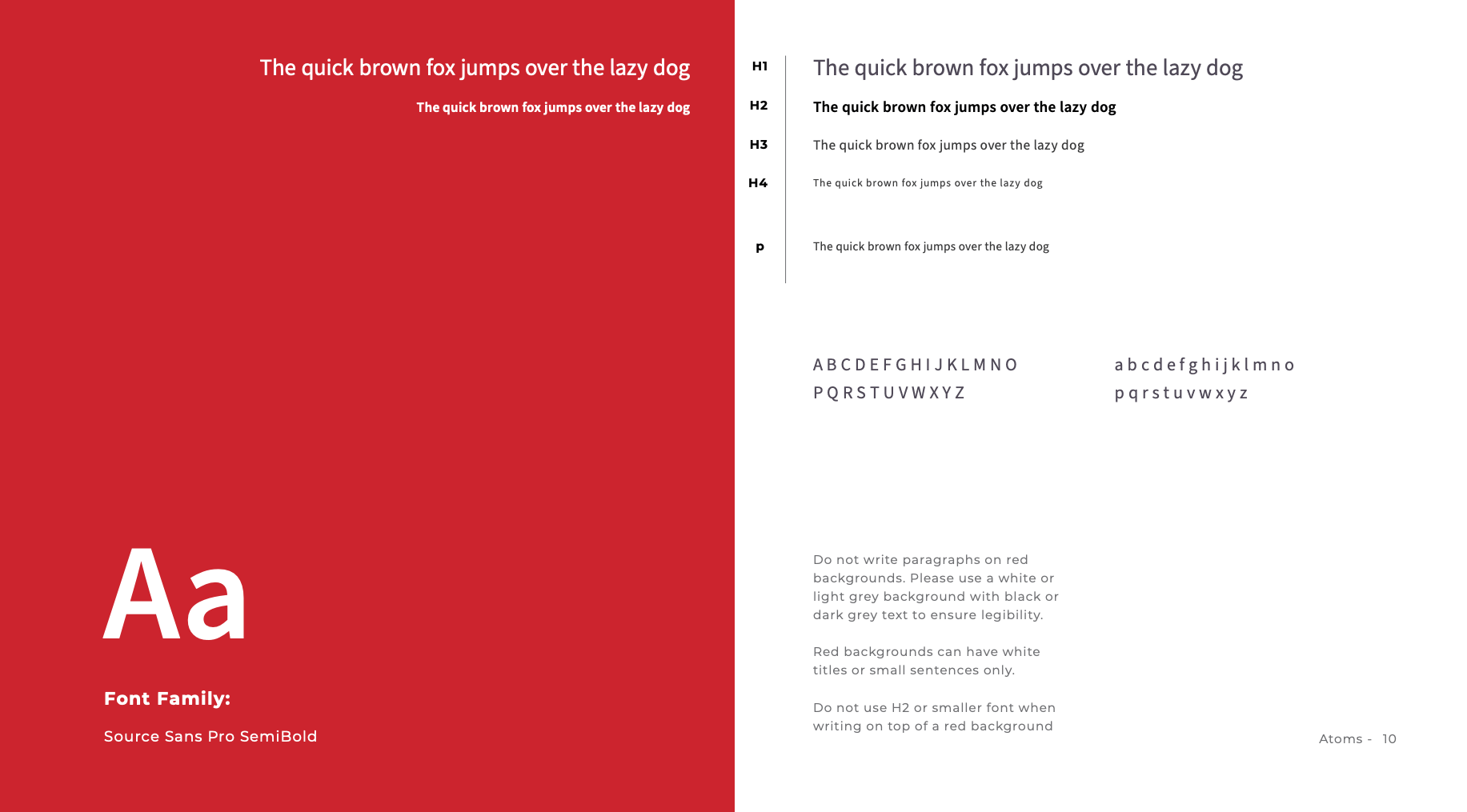
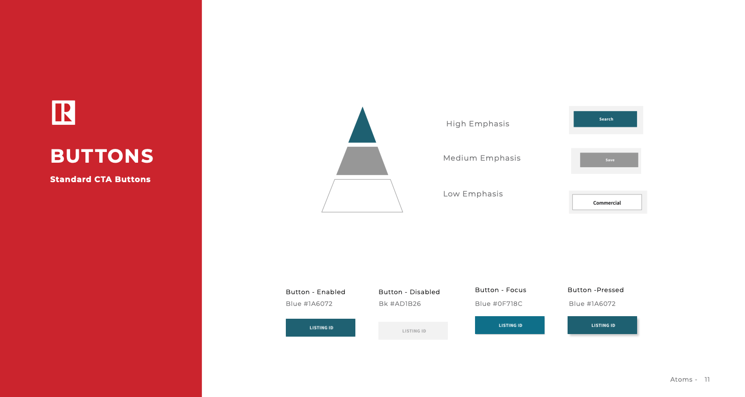
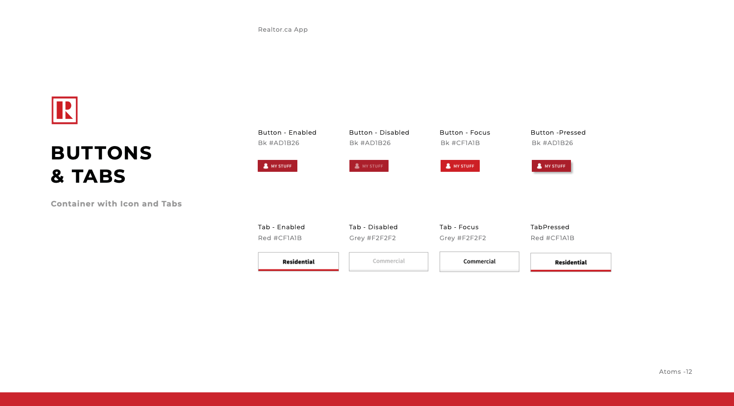
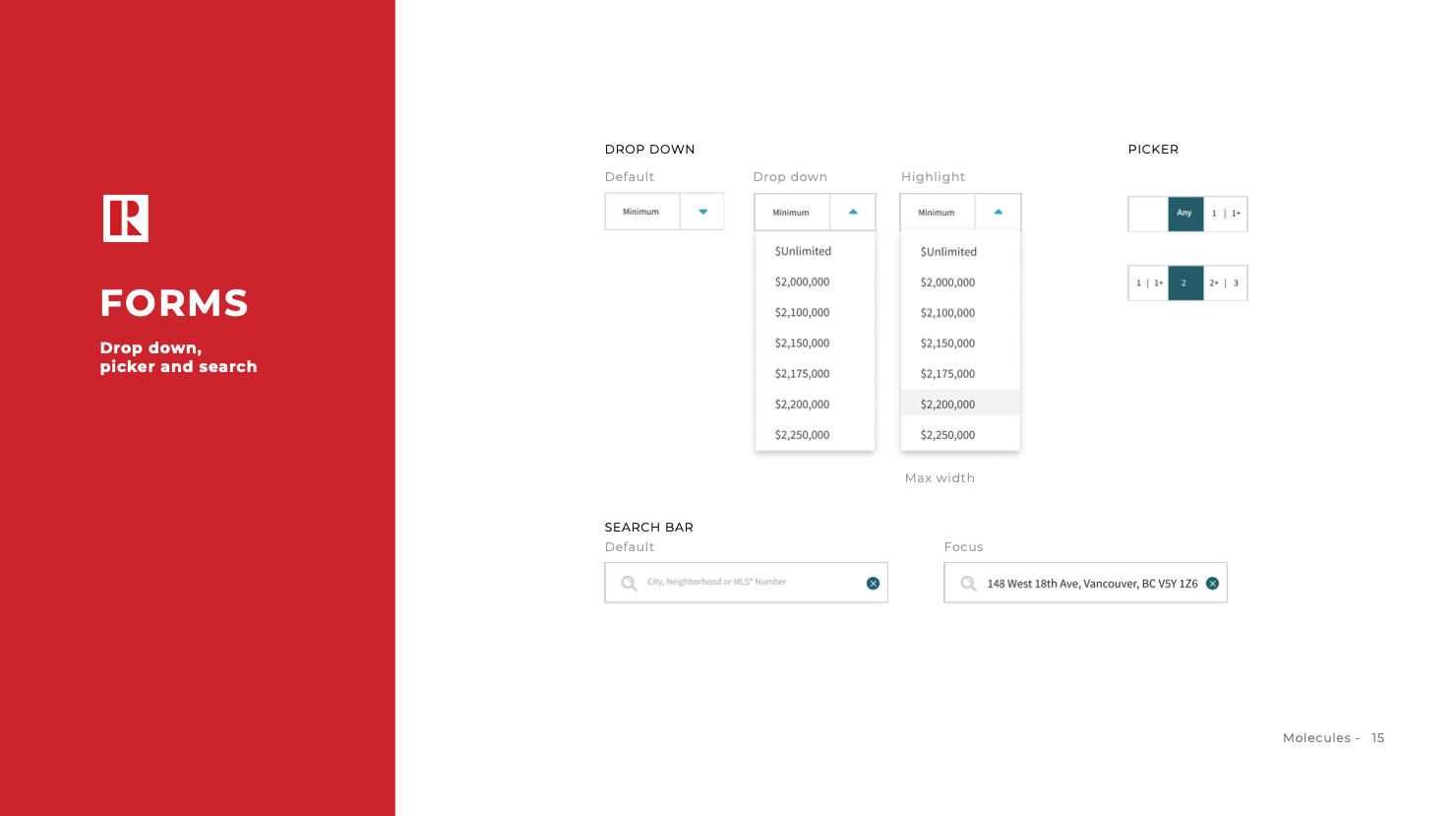
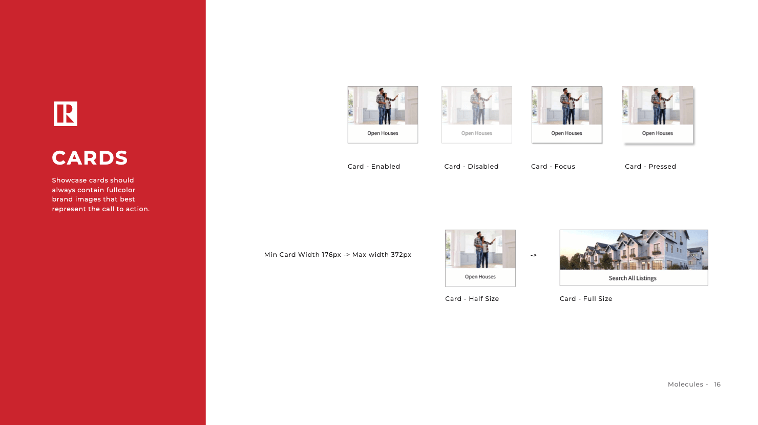
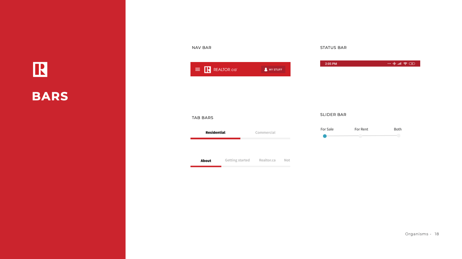
Created a UI library to ensure future consistency across a brand and product
1. Heuristic Evaluation
Heuristics to be evaluated:
- Visibility of system status
- Match between system and the real world
- User control and freedom
- Consistency and standards
- Error prevention
- Recognition rather than recall
- Flexibility and efficiency of use
- Aesthetic and minimalist design
- Help users recognize, diagnose, and recover from errors
- Help and documentation
The severity was based from zero to 4 as follow:
0. I don’t agree that this is a usability problem at all
1. Cosmetic problem only – need not be fixed unless extra time is available on project
2. Minor usability problem – fixing this should be given low priority
3. Major usability problem – important to fix, so should be given high priority
4. Usability catastrophe – imperative to fix this before product can be released
Search and View Properties Screens
The digital product task flow we selected was the task of searching and viewing properties. The following are the screens we focused on for this task.
Home Page
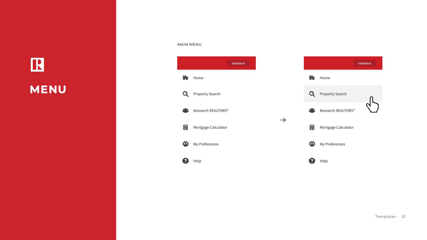
Menu
Filter
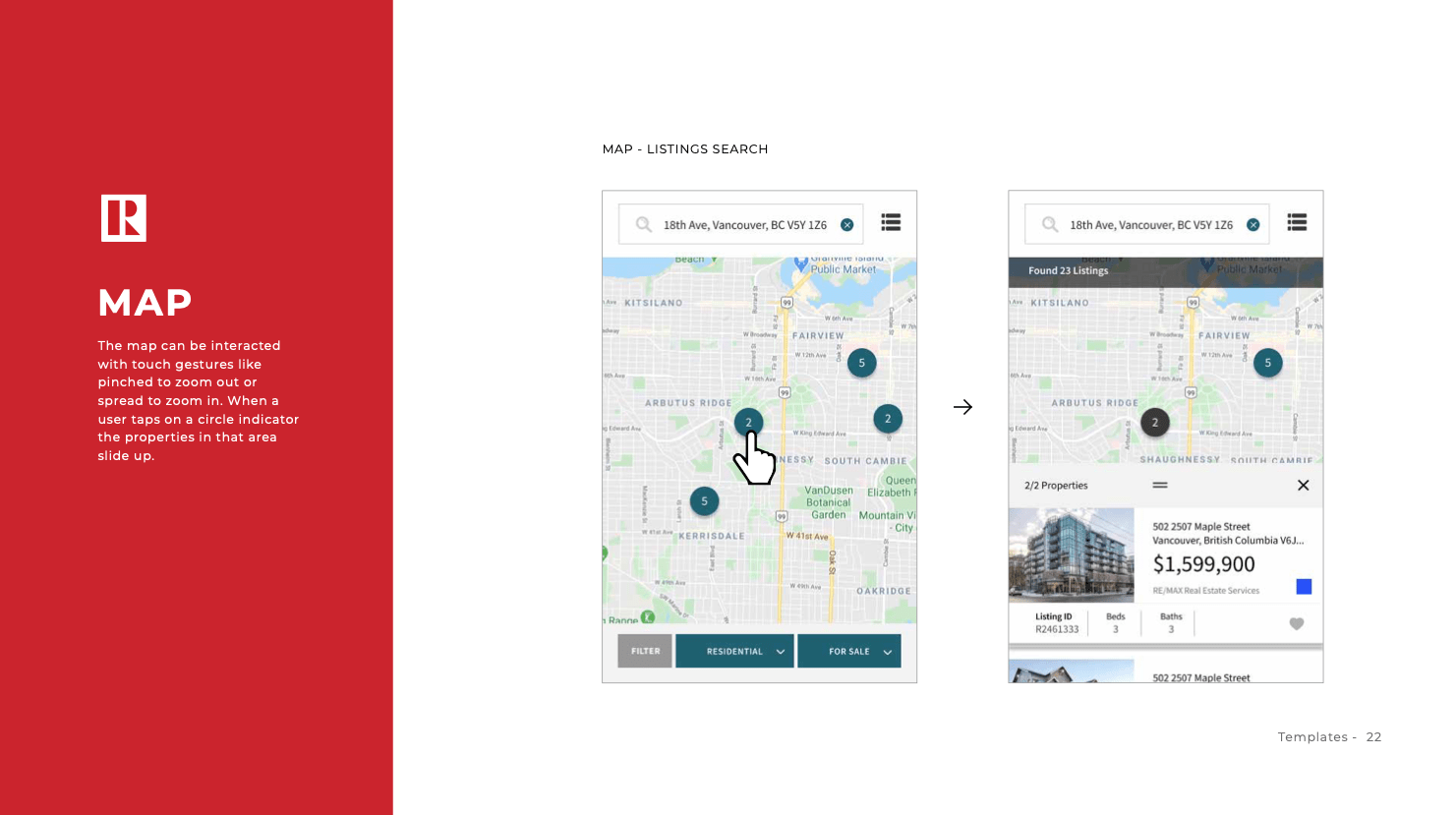
Map
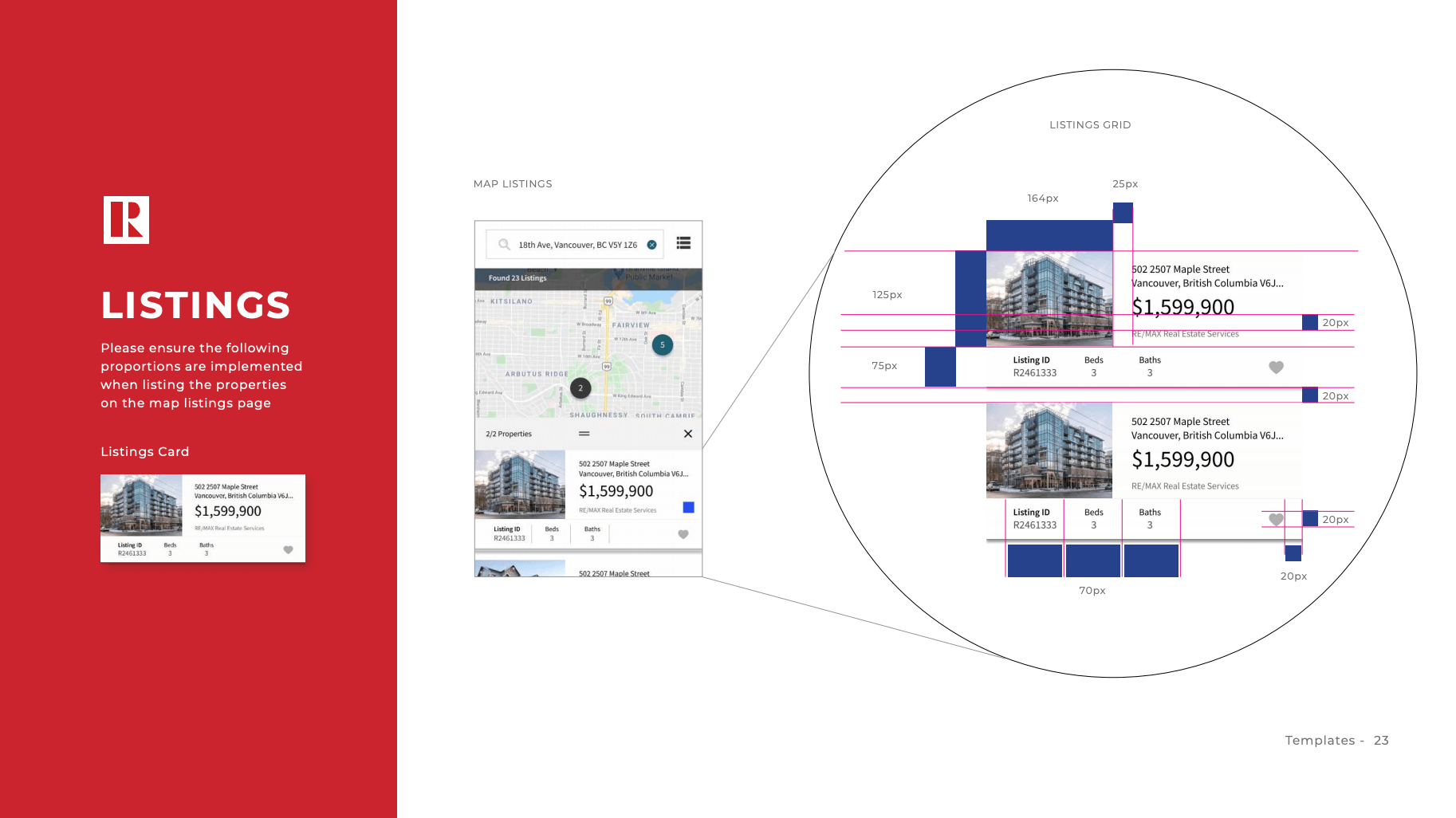
Listings
Property


Home Page
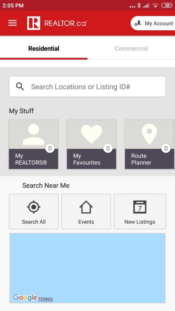
Heuristic Violated: Match between system and the real world
Severity: 3/4
Information should appear in a natural and logical order, with words, phrases and concepts familiar to the user.
Users would be a custom to searching properties by City, Neighborhood or MLS#
Heuristic Violated: Consistency and standards
Severity: 3/4
Users should not have to wonder whether different words, situations, or actions mean the same thing.
- ‘My Account’ button at the top right, is falling off the screen and has a different function in the following screens
- My Stuff and Search near me sections have different design styles
Heuristic Violated: Aesthetic and minimalist design
Severity: 3/4
Dialogues should not contain information which is irrelevant or rarely needed.
- The bottom map is currently irrelevant in this screen as it doesn’t serve a specific function
Heuristic Violated: Flexibility and efficiency of use
Severity: 3/4
Allow users to tailor frequent actions
- While showcasing personal user information in this front page will help the user accelerate and access frequent actions. The user is unable to recognize that the cards under “My stuff” have the ability to be scrolled horizontally, therefore missing half of the information.
Menu
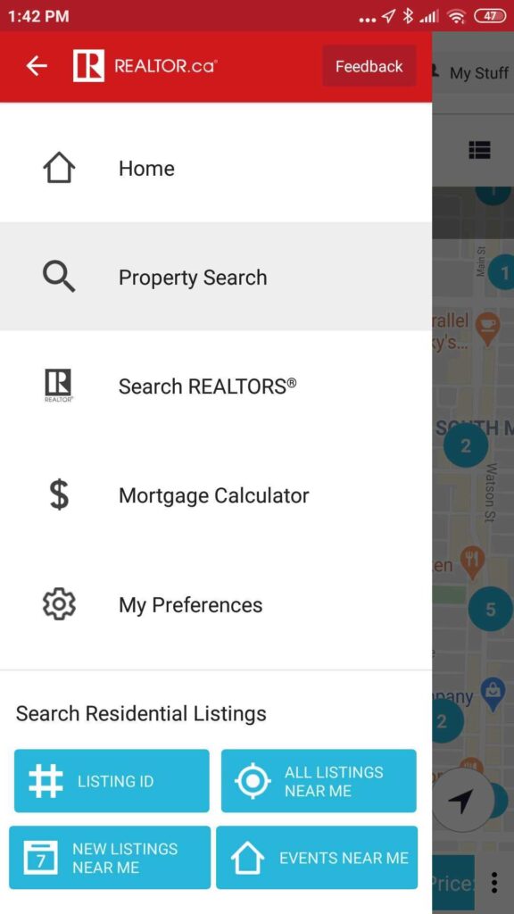
Heuristic Violated: Aesthetic and minimalist design
Severity: 4/4
Keep focus on the essential task with web accessible colors. Accessibility is essential for people with disabilities and useful for all.
- The blue color (#28b6dc) used throughout this app for buttons with the use of white text on top, failed the accessibility contrast test.
Heuristic Violated: Match between system and the real world
Severity: 3/4
Information should appear in a natural and logical order, with words, phrases and concepts familiar to the user.
- Most home buyers would be looking for ‘Open House’ instead of ‘Events Near Me’.
Heuristic Violated: Consistency and standards
Severity: 3/4
Users should not have to wonder whether different words, situations, or actions mean the same thing.
- Use of the same icon for different functions like the buttons Home and Events
Filter
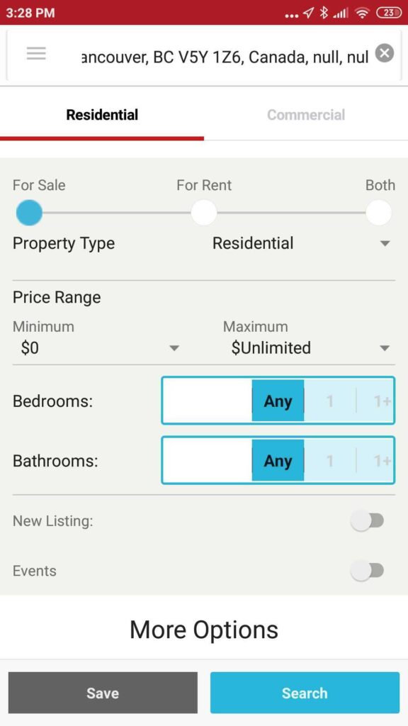
Heuristic Violated: Consistency and standards
Severity: 1/4
Users should not have to wonder whether different words, situations, or actions mean the same thing
- The header on the Homepage and Filter page are inconsistent
Heuristic Violated: Aesthetic and minimalist design
Severity: 2/4
Keep focus on the essential task with web accessible colors. Accessibility is essential for people with disabilities and useful for all.
- The search box should not contain information which is irrelevant
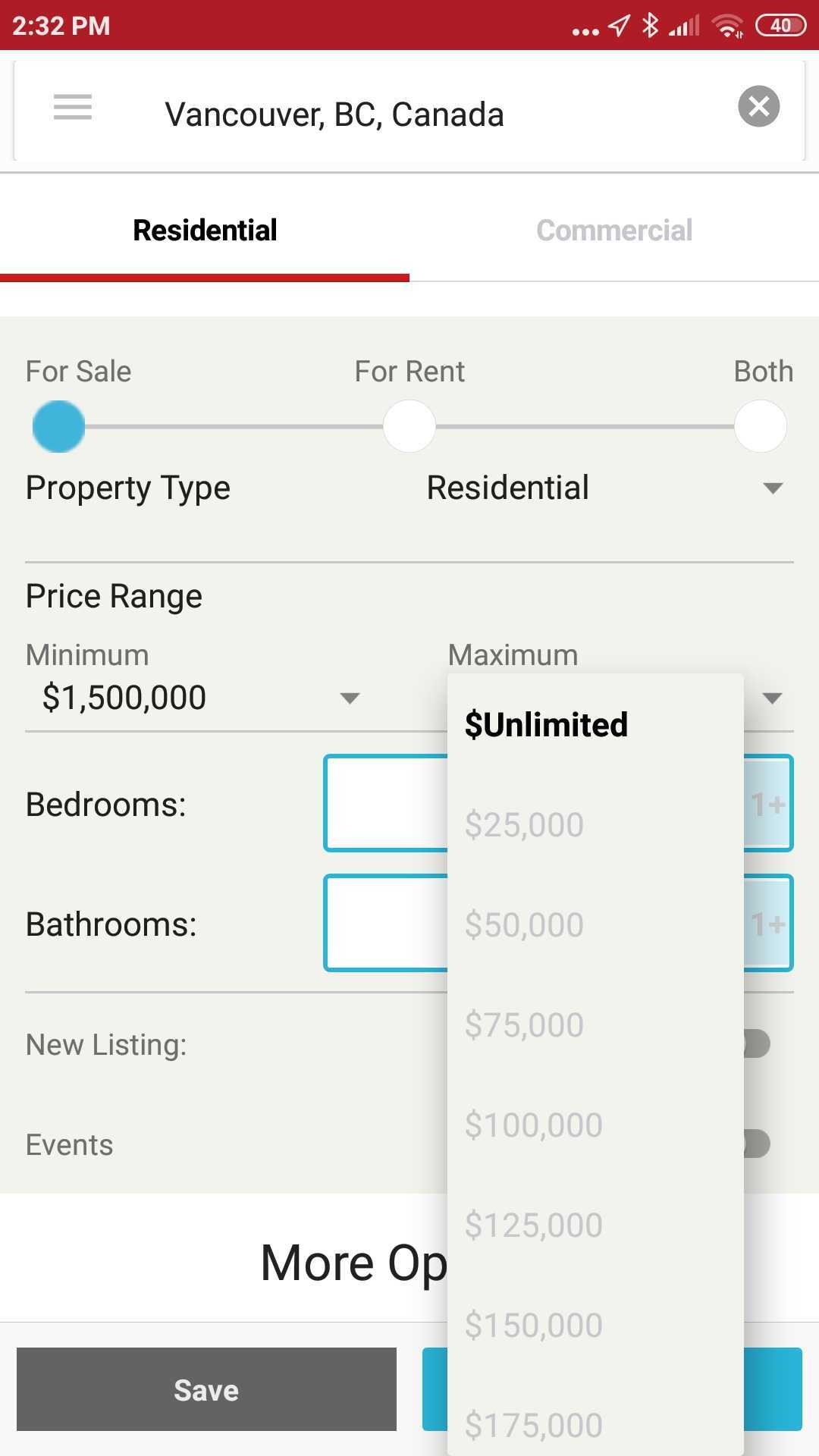
- The filter options are too condensed on page
Heuristic Violated: Flexibility and efficiency of use
Severity: 4/4
Allow users to tailor frequent actions
The process of selecting a maximum after you have selected a minimum could be faster by eliminating all the unnecessary, grayed out numbers from the drop down menu.
Map

Heuristic Violated: Help and documentation
Severity: 4/4
Even Though it is better if the system can be used without documentation, it may be necessary to provide help and documentation. However, accessing a non-responsive website via mobile stops the user from getting the information they require
- The help button takes you to the FAQ in a non-responsive website.
Heuristic Violated: Aesthetic and minimalist design
Severity: 3/4
Dialogues should not contain information which is irrelevant or rarely needed.
The buttons on this menu look the same but have different actions when you press them which confuses users.
Listings
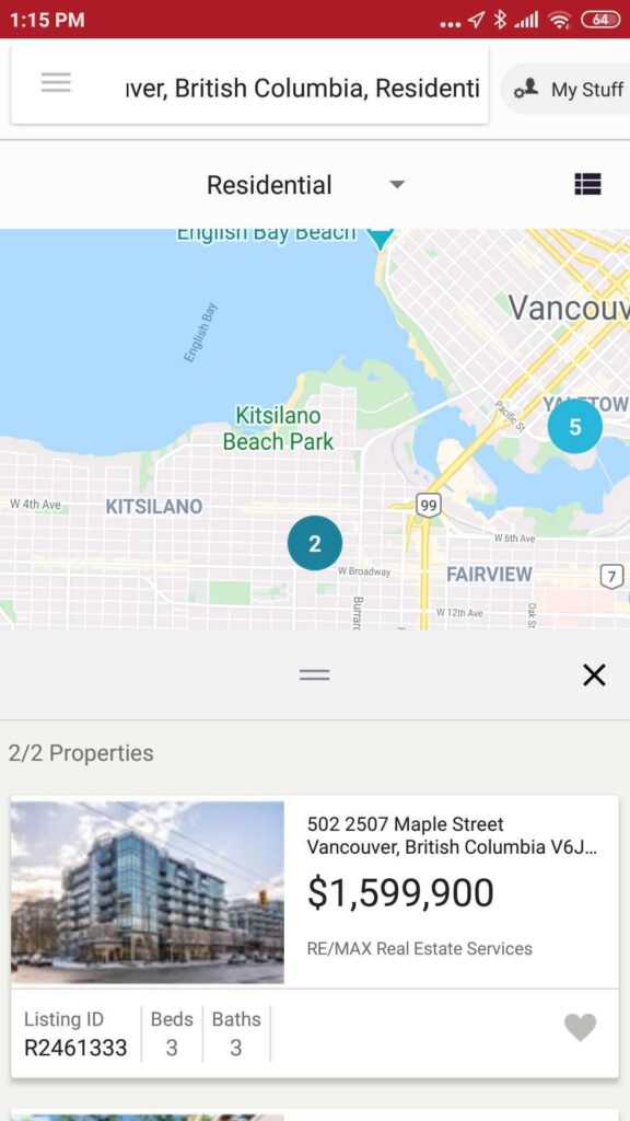
Heuristic: Match between system and the real world
Severity: 0/4
Follow real-world conventions, making information appear in a natural and logical order.
- Having the map still in the listings view allows the user to see the location of the listing in the neighbourhood they are interested in
Heuristic: Aesthetic and minimalist design
Severity: 0/4
Dialogues should not contain information which is irrelevant or rarely needed.
- The listings are clear and have the right amount of information a user would need before wanting more information
Property

Heuristic: Visibility of system status
Severity: 2/4
The system should always keep users informed about what is going on, through appropriate feedback within reasonable time.
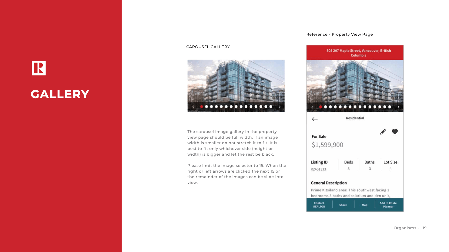
- Carousel indicators go off screen due to the amount of photos making it difficult for users to see where they are in the scroll.
2. Re-Design
Below you can see the before and after of each screen. Simply drag the circle arrows in the middle of each prototype left or right.
Home

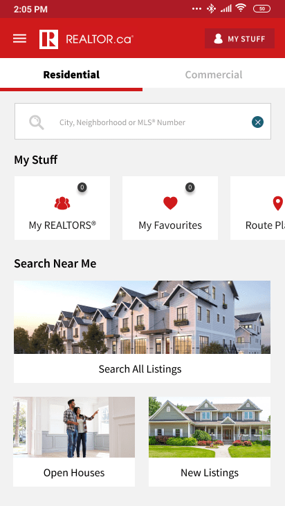
- Consistent My Account and My Stuff buttons
- Reworded search box to City, Neighbourhood or MLS Number
- Expanded the width of the cards to help indicate that these boxes are scrollable
- Simplified the amount of icons on the homepage and continued with the overall look of the website to unify the brand
- Removed the map due to being irrelevant
Menu

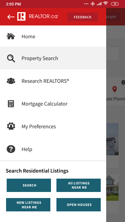
- Accessible color adjustment. We looked at the the Realtor.ca website and their use of blue was an accessible color. Therefore we used the same secondary blue of their buttons (#225C 6A) to increase accessibility and consistency between platfoms
- Re-designed the button Events near me to Open Houses as this is most relevant to most users.
Filter

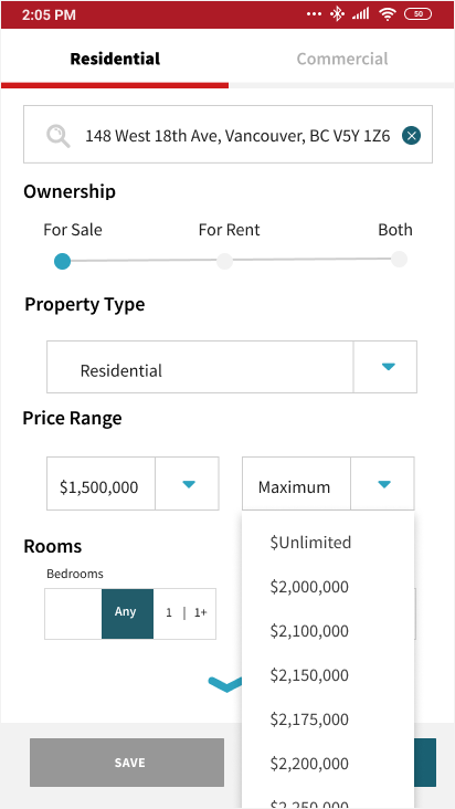
- Created a consistent header on all pages
- Removed unnecessary text from displayed search
- Added more white space on this page to create more ease in reading for users
- Eliminating next grayed out numbers
Map
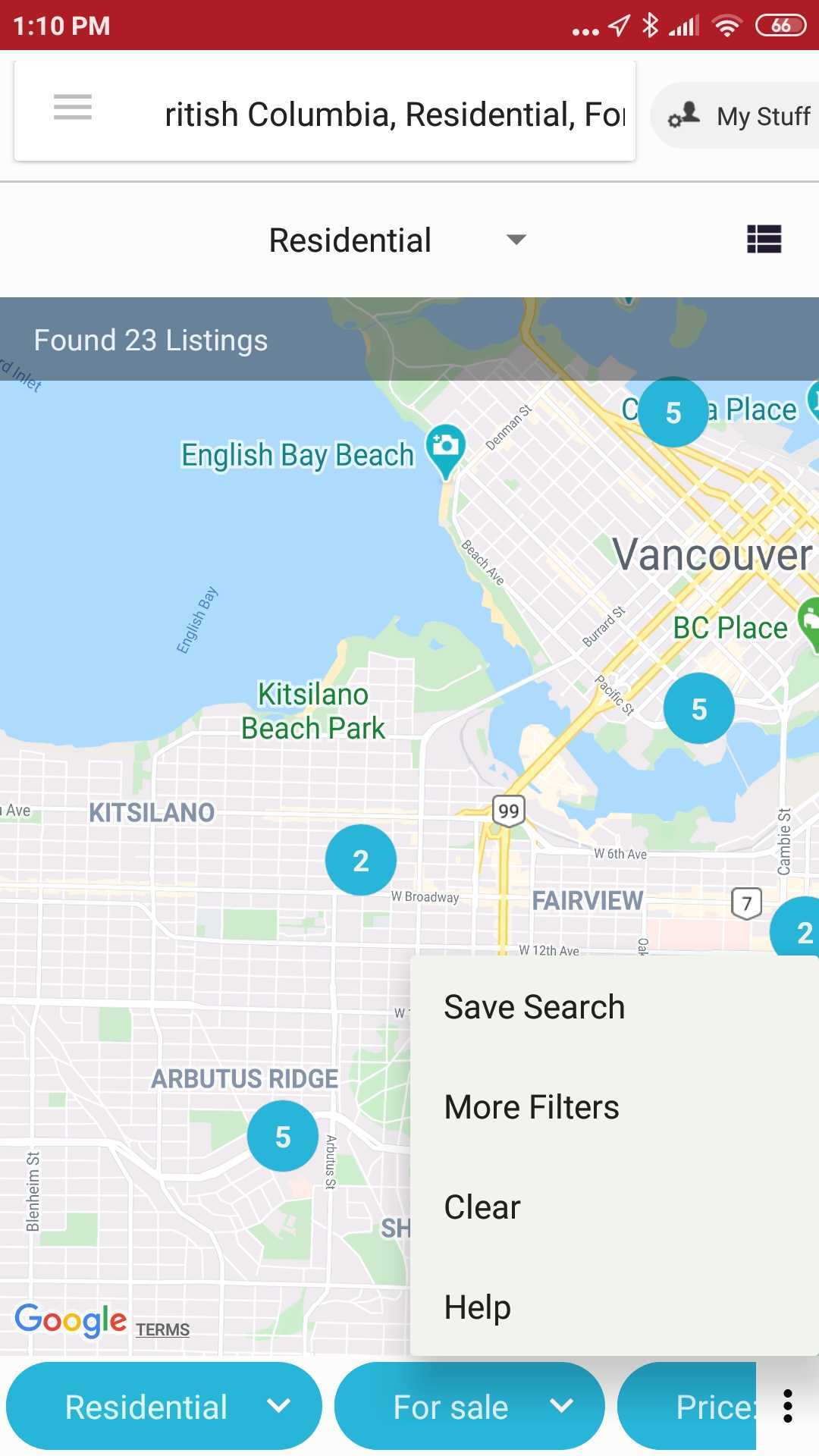
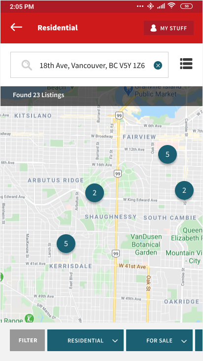
- We eliminated the more menu in the map section and included a filter button in the already existing button you can use to refine your search
- We moved the Help button to the Menu navigation
Listings

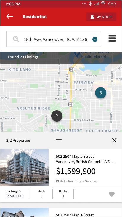
- Although the page didn’t have any violation, we add the header to be consistent and the new secondary colour with pressed state
Filter
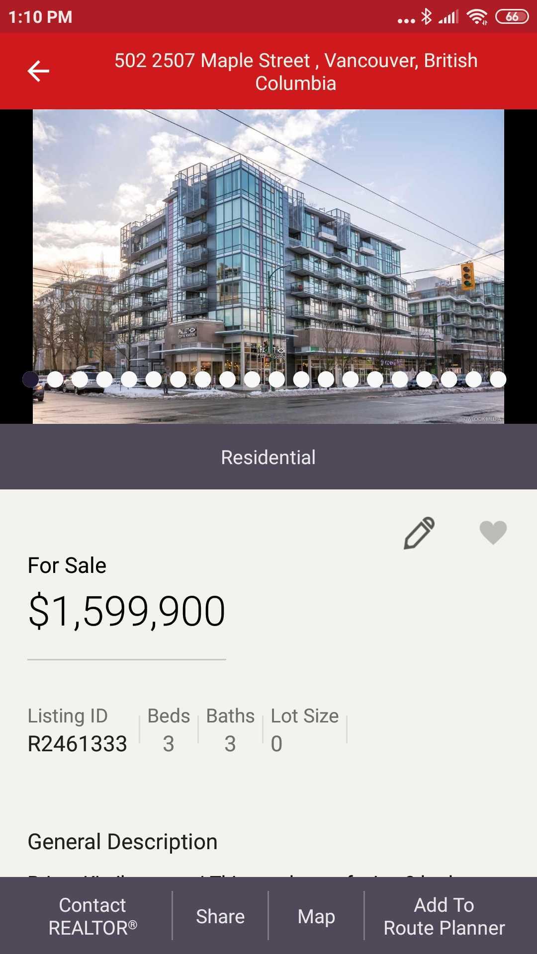
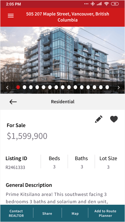
- Limited photo carousel to 15 circles on one screen with the ability to see more by scrolling with left and right arrows
New Page – FAQ
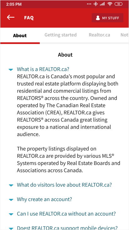
- We moved the Help button to the Menu navigation
- Created a FAQ page within the application

